대표어
대표어
 학술연구정보서비스(KERIS)
권호기사보기
| 기사명 | 저자명 | 페이지 | 원문 | 기사목차 |
|---|
결과 내 검색
동의어 포함
표제지
목차
Abstract 9
I. 서론 12
1. 연구의 목적 12
2. 연구방법 및 범위 13
II. 포스트모더니즘과 시대정신 15
1. 포스트모더니즘의 시대정신 15
1) 포스트모더니즘의 발생배경 15
2) 포스트모더니즘의 예술적 표현경향 18
2. 포스트모더니즘시대의 디자인 특성과 경향 24
3. 포스트모더니즘이 현대미술에 미친 영향과 디자인에 있어 탈장르, 다원화, 혼성 모방의 흐름과 후기변화 26
1) 포스트모더니즘이 현대미술에 미친 영향 26
2) 포스트모더니즘 디자인에 있어 탈장르, 다원화, 혼성 모방의 흐름과 후기변화 29
III. 옵아트와 타이포그래피의 조형적 분석 31
1. 옵아트의 발생배경과 조형적 특성 31
1) 옵아트의 개념 31
2) 옵아트의 발생 배경 32
3) 옵아트의 조형적 특성 및 사례 34
2. 타이포그래피의 개념과 발전 48
1) 타이포그래피의 개념 48
2) 타이포그래피의 발전 49
3. 옵아트와 타이포그래피의 조형적 결합 61
1) '옵-타이포그래피'의 조형성 61
2) '옵-타이포그래피'의 적용사례 및 현황 63
IV. 옵아트와 타이포그래피의 조형적 가능성 68
1. '옵-타이포그래피'(Op-Typography)의 조형적 가능성 연구 68
2. 연구 작품 예시 및 양식 해석 70
1) 연구 작품의 양식 해석 (1): 바이러스의 이미지와 원소 기호 및 다각적인 시선 74
2) 연구 작품의 양식 해석 (2): 대지의 이미지와 색채상징 93
3) 연구 작품의 양식 해석 (3): 문자기호와 공간감 및 운동감 118
4) 연구 작품의 양식 해석 (4): 최근의 연구 작품 143
3. '옵-타이포그래피'의 가능성 및 비전 174
V. 결론 176
참고문헌 180
〈그림 1〉 조셉 앨버스 작품 37
〈그림 2〉 빅토르 바자렐리의 작품 38
〈그림 3〉 야코프 아감의 작품 39
〈그림 4〉 브리짓 라일리의 작품 40
〈그림 5〉 로스 블레크너의 작품 41
〈그림 6〉 필립 타피의 작품 42
〈그림 7〉 크루즈 디에즈의 작품 43
〈그림 8〉 붉은후지산, 1825년 作 44
〈그림 9〉 무라카미 다카시 作 44
〈그림 10〉 쿠사마 야요이 作 44
〈그림 11〉 koshimaki-osen 다다노리 요코오 作 45
〈그림 12〉 '헬멧, 카와시마 히데아키 作 45
〈그림 13〉 딜립 샤르마 作 46
〈그림 14〉 'Homage to elders'2007 비나이 샤르마 作 46
〈그림 15〉 자미니 로이 作 '두르가 여신' 47
〈그림 16〉 파하드 후세인 作 47
〈그림 17〉 마더 앤 차일드 55
〈그림 18〉 'No More War!'포스터 56
〈그림 19〉 스위스 포스터 바젤, 1984 56
〈그림 20〉 타이포그래피쉐 모나츠브래터 잡지표지, 1971 57
〈그림 21〉 'Cal Arts View', 1978 59
〈그림 22〉 The Diva is Dismissed Poster 59
〈그림 23〉 Issue2 X POETRY Norman Watson 60
〈그림 24〉 마우로 디 도나티스의 작품 64
〈그림 25〉 1985년 일본 츠쿠바박람회 기념품옵아트 타이포그래피 홍보카탈로그 64
〈그림 26〉 'Tokyo TDC Seoul 2011' 64
〈그림 27〉 TDC '일본 타이포' 64
〈그림 28〉 2008년 TDC 전시 64
〈그림 29〉 삼원페이퍼 갤러리 - Tokyo TDC 2010 64
〈그림 30〉 HANNA VIKTORSSON 작품 65
〈그림 31〉 Andreas Leonidou, 'Im cheap' 65
〈그림 32〉 Ann Lee, 'm, m paris' 65
〈그림 33〉 EL PUNTO DEL MARKET 66
〈그림 34〉 HAPPY NEW YEAR-VOLTIO 66
〈그림 35〉 MR. SINGH 작품 사례 66
〈그림 36〉 MUSIC BOX SKY-VOLTIO 67
〈그림 37〉 predrag milankovic, 'Morderous inent' 67
〈그림 38〉 predrag milankovic, 'Years& Numbers.1' 67
〈그림 39〉 predrag milankovic, 'Years& Numbers.2' 67
〈그림 40〉 3회 개인전 팜플렛 174
[작품 1-1] VIRUS III 75
[작품 1-2] SILENCE 78
[작품 1-3] 신기루 81
[작품 1-4] VIRUS VI 84
[작품 1-5] EARTH I 87
[작품 1-6] VIRUS IV 90
[작품 2-1] EARTH II 94
[작품 2-2] EARTH V 97
[작품 2-3] 고양이 100
[작품 2-4] 반전 103
[작품 2-5] 호기심 II 106
[작품 2-6] 톰과 제리 109
[작품 2-7] 거미 112
[작품 2-8] 호기심 I 115
[작품 3-1] COLON AND SEMI-COLON 119
[작품 3-2] OBJECT 122
[작품 3-3] 잠자리 125
[작품 3-4] CENTER 128
[작품 3-5] A, A, A 131
[작품 3-6] HOLD 134
[작품 3-7] PURPLE 137
[작품 3-8] 나 AND 4 140
[작품 4-1] ㅎ (한글자음) 144
[작품 4-2] W (알파벳) 147
[작품 4-3] 자연 150
[작품 4-4] Typo IV(OPT) 153
[작품 4-5] Typo V (postmodernism) 156
[작품 4-6] 가나다 159
[작품 4-7] ART 162
[작품 4-8] ㅅ (한글자음) 165
[작품 4-9] Typo III(Ai) 168
[작품 4-10] A (알파벳) 171
The purpose of this study is to suggest the enhancing diversity and the new formative possibility of 'Op-Typography' as a mean of the visual communication by applying a combination of Op art and typography, focusing on the characteristics of the postmodernism trend in the 21st century.
On this study, the method which shows the formative possibility was selected as the study method focused on the theoretical and case study, and research work.
The second chapter analyzed the concept, characteristics, and case of postmodernism. The third chapter studied the concept, generative background, formative characteristics and case study of Op art through the formative analysis of the Op art and typography, and researched the formative combination between the typography and the Op art, and the process of development and the concept of Typography.
The fourth chapter discussed about the formative possibility and the meaning of 'Op-Typography' in Contemporary art from the various angles through the example of study works and its style analysis, and understood the formativeness, the application case study and the current state of 'Op-Typography' by applying the combination with Op art and typography,
Considered the approach methods of a classified catalogue in this study, firstly, the study subject was the image of nature virus and the multilateral human eyes interpreted as the future oriented communication.
Secondly, this study materialized the overall work image combined with typography with the image of the earth and the symbol of color using nature and text.
Thirdly, the patterns taken from typography and nature were used in this study as the subjects of the symbol of text, and sense of space and kinesthetic, and the work in this study was made from the geometric features such as the inorganic and organic lines, which generated the shape of the features.
Fourth, the current research work expressed the beauty of sculpture changed from the shaped image abstracted from nature related to the motive of the third work in connection with the optical illusion and rhythmic image of Op art combined with the typography,
and this study reinterpreted the unique patterns of the natural Op-art, and found the unified universality designing creatively the different feature through the various expressions.
The diversification of expression tried to express the purposive tendency of formative art, the expansion of the area, and centripetal orientation realizing the principles of 'Op-Typography'.
The typography can be a symbol, but it could be a formative feature in the way that it is also a sign shown visually. It is the illustrations imagined for the meaning of typography and the extension of area, and it will open the new era of communication conveyed and constructed organically the visual sense through the typography.
According to this study, the 'Op-typography' will be used to explore new ideas and contribute to the more creative thinking of typography, and it will be expected to utilize for not only the beauty of sculpture, but also the meaning and value of the new style in the design area.
As we discussed, this study purpose is aimed to approve that the 'Op-typography' covered until the artistry in the fine art area when the 'Op-typography' was carried out, as covered some boundaries such as the fine art and design area through the various imitation, diversification, new genre of the postmodernism's ear.
As a result of this paper, the significance and possibility can be summarized as follows.
First, the 'Op-typography', shown as the attempt to break away from closing of the text function of character and the structural fixation, can be the new text design due to a combination of Op-art and typography.
Second, the 'Op-typography' should be considered in the work dealt with the feature type of the opposite concept and the typographic function, it can be the communication design delivered organically the visual sense and the simple formative beauty to explore the new creative ideas.
Third, the 'Op-typography' has the function of the language conveyed the visualized text message. The typography is a kind of formative design from the visible symbolic point of view, but it can be a kind of marks at another point of view.
Fourth, the 'Op-typography' is the imaged illustration extended the areas and meaning of the typography.
Thus, the use of the 'Op-typography' will open the new era of communication to convey and consist organically of the visual sense.
This study will help to explore the new ideas and contribute on expanding of the expression area of the practical typography, and the 'Op-typography' will be utilized in the various design areas as the new style having not only the values and meanings but also the formative beauty.| 번호 | 참고문헌 | 국회도서관 소장유무 |
|---|---|---|
| 1 | 한국의 근대디자인사, 서울: 미진사, 2008. | 미소장 |
| 2 | 오늘의 문화 지형학, 서울: 세계의 문학 1991년 겨울호 | 미소장 |
| 3 | 날염디자인, 서울: 조형사, 1994. | 미소장 |
| 4 | 한글의 글자표현, 서울: 미진사, 1991. | 미소장 |
| 5 | 포스트모더니즘 원론, 서울: 책과사람들, 2005. | 미소장 |
| 6 | 포스트모더니즘, 서울: 연세대학교출판사, 2009. | 미소장 |
| 7 | 포스트모던 사회의 이해, 서울: 대진대학교출판부, 1999. | 미소장 |
| 8 | 시각 디자인의 기초, 서울: 미진사 1997. | 미소장 |
| 9 | 타이포그래피란 무엇인가, 서울: 홍디자인, 2008. | 미소장 |
| 10 | CI디자인+타이포그래피, 서울: 안그라픽스, 1998. | 미소장 |
| 11 | 디자인+타이포그래피, 서울: 안그라픽스, 1998. | 미소장 |
| 12 | 현대 타이포그래피 (비판적 역사 에세이), 서울: 스펙터프레스, 2009. | 미소장 |
| 13 | 현대미술의 흐름, 서울: 미진사, 1985. | 미소장 |
| 14 | 현대미술이론2, 서울: 형설출판사, 2003. | 미소장 |
| 15 | 시각커뮤니케이션 디자인, 서울: 미진사, 1993. | 미소장 |
| 16 | 기초디자인, 서울: 조형사 1991. | 미소장 |
| 17 | 기초디자인, 서울: 조형사, 1994. | 미소장 |
| 18 | 북악청년미술아카데미, 한국현대미술과 포스트모더니즘, 서울: 한국문연, 1992. | 미소장 |
| 19 | 모더니즘, 포스트모더니즘, 서울: 리얼리즘, 1993. | 미소장 |
| 20 | 사단법인한국색채학회, COLORIST, 서울: 도서출판국제, 2006. | 미소장 |
| 21 | 옵아트, 서울: 미진사, 1992. | 미소장 |
| 22 | 한국미술과 포스트모더니즘(미진 신서 38), 서울: 미진사, 1993. | 미소장 |
| 23 | 옵아트, 서울: 미진사, 1987. | 미소장 |
| 24 | 디지털 타이포그래피, 서울: 임프레스, 2003. | 미소장 |
| 25 | 문화콘텐츠를 위한 시각 예술과 대중문화, 서울: 진한도서, 2001. | 미소장 |
| 26 | 포스트모더니즘에 대한 성찰, 서울: 살림, 2003. | 미소장 |
| 27 | 디자이너가 꼭 알아야 할 타이포그래피, 서울: 디자인하우스, 2009. | 미소장 |
| 28 | 동아 새 국어사전, 서울: 동아, 1994. | 미소장 |
| 29 | 현대사상사, 서울: 먼빛으로, 2009. | 미소장 |
| 30 | 텍스타일 디자인, 서울: 미진사, 1995. | 미소장 |
| 31 | 디자인 통론, 서울: 유림문화사, 1996. | 미소장 |
| 32 | 전환기의 미술, 서울: 열화당 1974. | 미소장 |
| 33 | 회화의 역사 H.W.&.D.J 잰슨, 서울: 열화당, 1977. | 미소장 |
| 34 | 야요이 쿠사마, 야요이 쿠사마 展, 서울: 아트선재센터, 2003. | 미소장 |
| 35 | 월간미술편집부, 세계미술용어사전, 서울: 월간미술 1998. | 미소장 |
| 36 | 타이포그래피 천일야화, 서울: 안그라픽스 2004. | 미소장 |
| 37 | 문자의 역사, 서울: 도서출판 새날, 1995. | 미소장 |
| 38 | 포스트모더니즘(현대미술운동총서), 서울: 열화당, 2003. | 미소장 |
| 39 | 동양과 서양, 그리고 미학, 서울: 푸른 숲, 1999. | 미소장 |
| 40 | 정한외서편집부, EVENT EYES '94 VOL.3, 정한외서, 1992. | 미소장 |
| 41 | 매스 미디어와 미술, 서울: 시각과 언어, 1998. | 미소장 |
| 42 | 타이포그래피 교과서, 서울: 안그래픽스, 2002. | 미소장 |
| 43 | 서양미술사100장면, 서울: 한명, 2011. | 미소장 |
| 44 | 모더니즘 포스트모더니즘 리얼리즘 브랜든, 서울: 시각과 언어, 1993. | 미소장 |
| 45 | 한국색채연구소, 컬러리스트, 서울: 지구문화사, 2009. | 미소장 |
| 46 | 세계미술 용어사전, 서울: 중아일보, 1989. | 미소장 |
| 47 | 미술의 정사, 서울: 범호사, 1981. | 미소장 |
| 48 | 미술의 역사, 서울: 삼성출판사, 1988. | 미소장 |
| 49 | Rusconi Immagini milano, 1984. | 미소장 |
| 50 | Phase2, text: lewis blackwell | 미소장 |
| 51 | An Introduction to Studying Popular Culture. London: Routledge. 2000. | 미소장 |
| 52 | Type Design from the Victorian Era to the Digital Age. Chronicle Books. 1999. | 미소장 |
| 53 | The History of Art, Abstraction, Thames and Hudson, 1977. | 미소장 |
| 54 | Phase 2. Paris: Fabrica, 1997. | 미소장 |
| 55 | Logo World -1600 of the World's Newest Logo Marks. Tokyo: P.I.E Books, 2001. | 미소장 |
| 56 | ED-71, a vitamin D analog, is a more potent inhibitor of bone resorption than alfacalcidol in an estrogen-deficient rat model of osteoporosis  |
미소장 |
| 57 | PAGEONE, 1000 Type Treatments, PAGEONE, 2005. | 미소장 |
| 58 | The Philosophy of Modern Art, New York: Horizon Press, 1953 | 미소장 |
| 59 | New Typographic Design. London: Laurence King Publishing Ltd, 2007. | 미소장 |
| 60 | Big Type. New York: Hearst Book Intl, 2002. | 미소장 |
| 61 | Getting it Right with Type: The Dos and Don'ts of Typography. Laurence King Publishers. 2007. | 미소장 |
| 62 | The One Club for Art & Copy, The One Show 20 Advertising, The One Club for Art & Copy, 1998. | 미소장 |
| 63 | The One Show V20 - Advertising's Best Print, Radio, TV. New York: Omnibook. 1998. | 미소장 |
| 64 | The New Typography. University of California Press. 2006. | 미소장 |
| 65 | The Graphic Language of Neville Brody. London: Universe Pub 1994. | 미소장 |
| 66 | The Graphic Language of Neville Brody 2. London: Universe Pub 2002. | 미소장 |
| 67 | 1000 Type Treatments: From Script to Serif, Letterforms Used to Perfection. Chicago: Rockport Publisher. 2004. | 미소장 |
| 68 | Layout Method DSS4. 東京: 美術出版社. 1967. | 미소장 |
*표시는 필수 입력사항입니다.
| 전화번호 |
|---|
| 기사명 | 저자명 | 페이지 | 원문 | 기사목차 |
|---|
| 번호 | 발행일자 | 권호명 | 제본정보 | 자료실 | 원문 | 신청 페이지 |
|---|
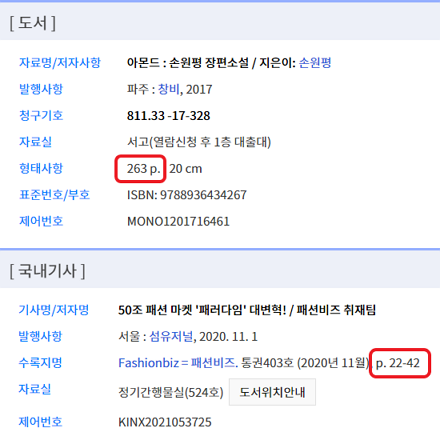
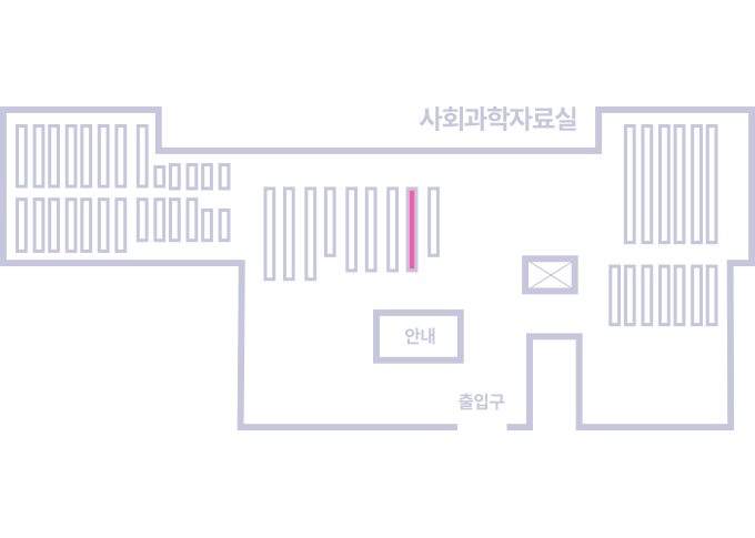
도서위치안내: / 서가번호:
우편복사 목록담기를 완료하였습니다.
*표시는 필수 입력사항입니다.
저장 되었습니다.